

Landing pages perform better when they are reviewed regularly. Learn what to check monthly across copy, forms, tracking, and conversion.
Many businesses treat landing pages as campaign assets that are built once, used for months, and reviewed only when performance becomes disappointing.
That is a slow way to improve.
A landing page does not need to be rebuilt every month. But it should be reviewed regularly.
Monthly improvement is usually more practical than yearly rebuilds because it keeps the page aligned with real campaign data, current offers, sales feedback, tracking accuracy, and user behaviour.
The problem with waiting a year is that issues compound quietly. A weak headline remains weak. A confusing form keeps creating friction. Tracking gaps persist. Sales keeps receiving low-context enquiries. Paid traffic continues to land on a page no one has properly reviewed since launch.
By the time the business decides to rebuild, it may have spent months sending traffic to a page that needed smaller fixes much earlier.
Landing pages are not static assets
A landing page is part of a growth system.
It sits between a traffic source and a business outcome. That outcome might be a demo request, quote enquiry, consultation booking, download, webinar registration, application, or call booking.
The page has to do several jobs:
Confirm the visitor is in the right place.
Explain the offer clearly.
Build enough trust to continue.
Answer common objections.
Make the next step easy.
Capture useful information.
Pass data to the right systems.
Track the conversion accurately.
If any of those jobs become weaker, the page can still look fine while producing poorer results.
Why yearly rebuilds miss the point
A yearly rebuild often feels productive because it is visible. New design, new sections, new copy, new layout.
But many landing page problems do not require a rebuild.
A form may ask for too much information.
A call to action may be too vague.
A proof point may be buried too low.
The mobile layout may hide the key message.
The page may not match the ad promise.
The CRM may not show which campaign produced the lead.
The thank-you page may not fire a conversion event.
The offer may have changed slightly, but the page still uses old language.
These are operational and optimisation issues. Waiting for a redesign delays the fix.
A monthly review creates a tighter feedback loop.
What changes month to month
Landing page performance is affected by more than design.
Campaign traffic changes. A page that worked for a warm email audience may not work for cold paid search traffic.
Sales feedback changes. The sales team may report that leads are asking the same question, misunderstanding the offer, or lacking budget fit.
Competitor positioning changes. The claims and proof that once felt strong may become ordinary.
Internal offers change. A business may adjust pricing, packaging, availability, service areas, or qualification criteria.
Technical conditions change. WordPress plugins update, tracking scripts move, forms are edited, cookie banners change, and CRM fields are adjusted.
User expectations change as they interact with different sites and tools.
A monthly optimisation rhythm helps the page keep up.
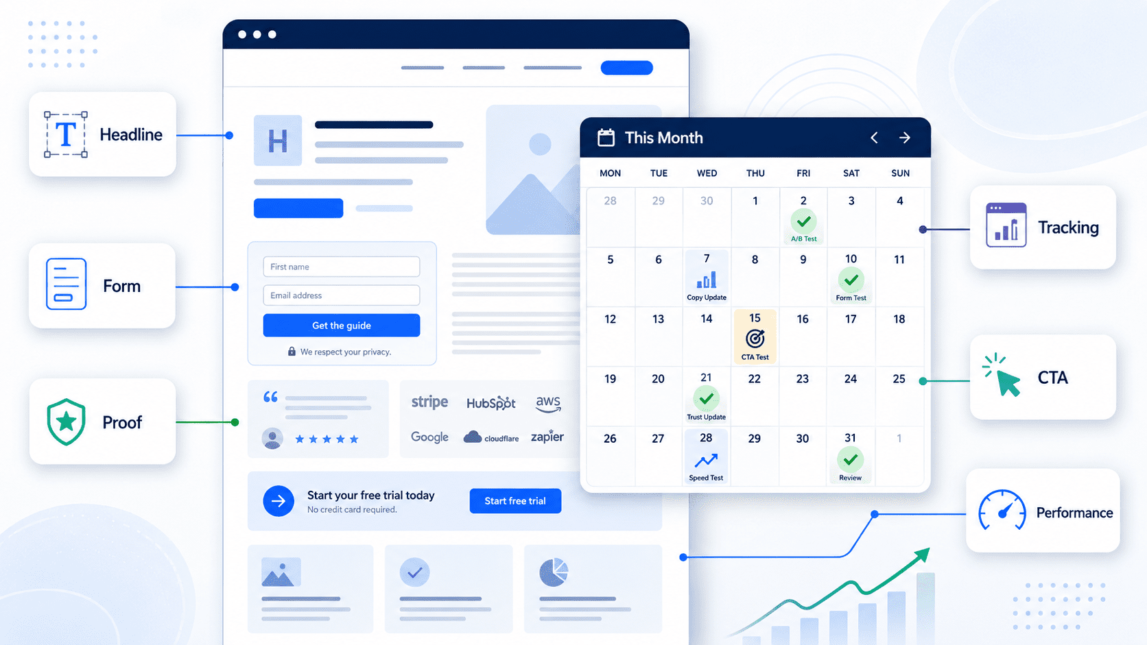
What to review monthly
Monthly landing page improvement does not need to be complicated. The goal is to identify the highest-value friction points and make controlled changes.
Message match
The first question is whether the page matches the source that sent the visitor there.
If the ad promises a WordPress maintenance plan, the landing page should not open with broad “digital solutions” language. If a LinkedIn post promotes CRM integration support, the landing page should make that offer obvious immediately.
Poor message match creates doubt. The visitor has to work too hard to connect what they clicked with what they see.
Review the headline, subheading, opening paragraph, and primary CTA against the traffic source.
Offer clarity
A landing page should quickly answer:
What is this?
Who is it for?
What problem does it solve?
What happens next?
Why should I trust this provider?
If the page is too abstract, visitors may leave even if the service is relevant.
For example, “Improve your digital operations” is less useful than “Monthly monitoring for website forms, CRM handoff, and conversion tracking.”
Clear does not mean simplistic. It means the reader can understand the offer without internal context.
Form friction
Forms are a common source of lost conversions.
A form may ask for fields the business does not need at the first step. It may fail on mobile. It may have unclear error messages. It may require a phone number for an offer where email would be enough. It may use a dropdown that does not match how prospects describe their needs.
Review form length, field labels, required fields, error handling, confirmation messages, and mobile usability.
Also check whether the form submission reaches the right place. A landing page is not performing if leads submit but do not reach sales cleanly.
Trust and proof
Landing pages need enough evidence to make the next step feel reasonable.
That evidence may include relevant examples, client types, process explanations, screenshots, short testimonials, certifications, case studies, or plain descriptions of how the work is handled.
The proof should match the offer. A landing page for analytics QA should show competence in tracking, reporting, and diagnostic work. A page for WordPress care should show operational reliability, not only visual design.
Monthly review should ask whether the current proof answers the current objections.
Tracking and attribution
A landing page cannot be improved properly if tracking is unreliable.
Check whether visits, form submissions, button clicks, thank-you pages, and conversion events are measured. Confirm that UTM parameters are passed where needed. Review whether the CRM receives campaign information.
Without this, the team may optimise based on incomplete evidence.
Tracking QA is especially important after changes to WordPress themes, form plugins, Google Tag Manager, cookie consent tools, or CRM integrations.
Mobile experience
Many landing page reviews happen on desktop because that is where teams work.
Visitors may experience the page differently.
On mobile, the headline may wrap badly. The CTA may be pushed too far down. The form may feel long. A sticky header may take too much space. A chat widget may cover the submit button. Images may slow loading.
A monthly review should include mobile testing, not just desktop design review.
Practical monthly landing page diagnostic
Use this checklist to improve landing pages in smaller, regular cycles.
Strategy and offer
- Is the offer still current?
- Does the page match the campaign or traffic source?
- Is the target reader obvious?
- Is the primary CTA specific?
- Does the page explain what happens after submission?
Copy and structure
- Is the headline clear without context?
- Does the first screen explain the value and next step?
- Are objections answered?
- Are proof points specific and relevant?
- Is any content outdated or too vague?
Form and lead flow
- Is the form working on desktop and mobile?
- Are required fields justified?
- Are error messages clear?
- Does the submission reach the correct inbox or CRM?
- Are leads assigned or labelled correctly?
Tracking and reporting
- Are pageviews tracked?
- Are form submissions tracked as conversions?
- Are UTMs preserved?
- Does the CRM show campaign source?
- Do ad platforms receive the correct conversion signal where applicable?
User experience
- Does the page load quickly enough for the campaign context?
- Are CTAs visible and consistent?
- Are mobile layouts usable?
- Are distractions removed?
- Are thank-you pages or next steps helpful?
Improvement log
- What changed this month?
- Why was it changed?
- What metric or feedback triggered the change?
- What should be reviewed next month?
Monthly improvement beats occasional overhaul
The strongest landing pages are rarely perfect at launch.
They improve through observation. Campaign data shows where visitors come from. Sales feedback shows what prospects misunderstand. Form data shows which fields matter. Analytics shows where tracking is incomplete. User experience checks reveal friction.
A monthly optimisation process turns those signals into practical updates.
That might mean changing a headline, shortening a form, adding a proof section, fixing a mobile layout, clarifying the CTA, correcting tracking, or improving the CRM handoff.
Small changes can be more useful than a major rebuild because they are closer to the evidence.
The aim is not constant tinkering. It is disciplined improvement.
Improve your landing pages before they need a rebuild
Muser Agency supports monthly conversion optimisation for businesses that depend on landing pages, forms, tracking, and CRM handoff. We help review what is working, identify friction, fix operational issues, and make focused improvements without waiting for a full rebuild.